Viewrail Digital Quote Experience
OVERVIEW
Simplifying purchase for 20,000+ Viewrail customers across a $100M+ revenue line
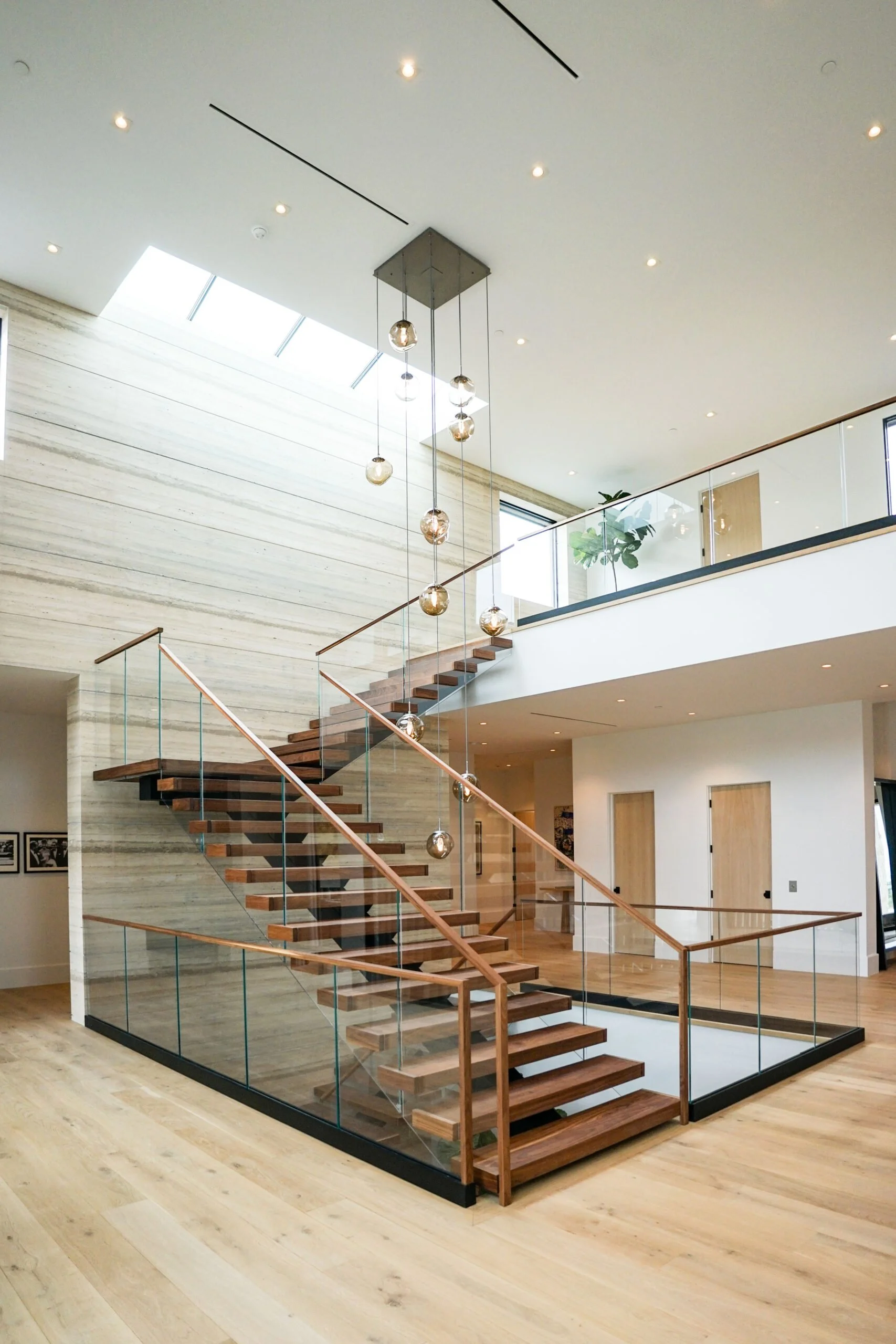
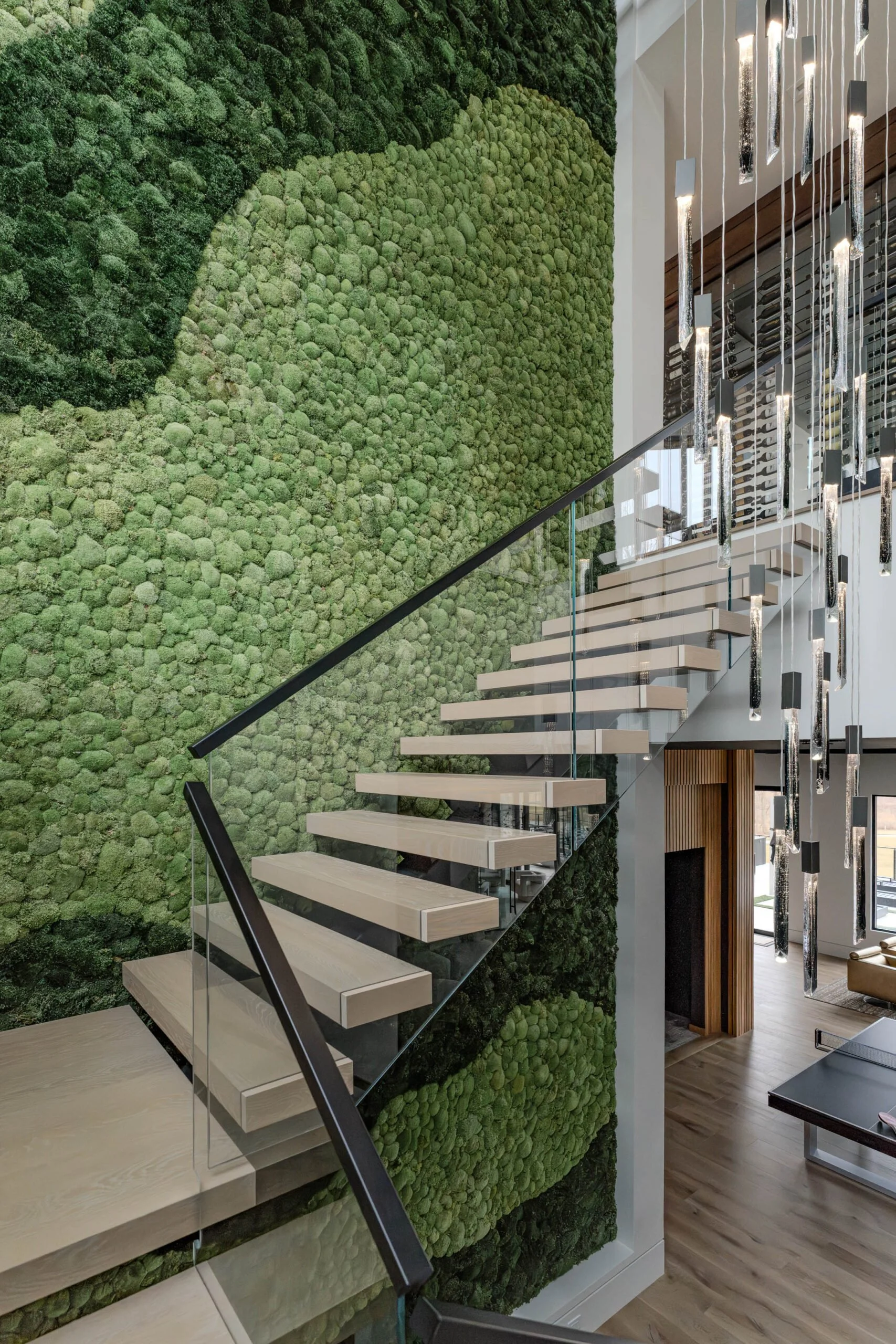
Viewrail designs, manufactures, and installs highly custom (and highly complex) stair and railing systems for luxury home owners and builders across the U.S.
Role: Lead UX Designer
Problem: Prolonged deal cycles and increased sales effort due to friction and uncertainty in the digital quote experience.


The Solution
The redesigned digital quoting experience increased users’ confidence in pricing and trust in both sales representatives and Viewrail, resulting in reduced support time and quicker approvals.
CONTEXT
“Design a way for internal users to upload images to a customer’s digital quote”
This redesign project began with a feature request driven by internal user needs and pain points, aimed at improving the customer experience.
DISCOVERY
“We want to improve the customer’s experience of this pivotal touchpoint.”
Through an early discovery session with stakeholders, I uncovered a broader goal behind the initial feature request. As stakeholders described what they believed users needed from the experience, it became clear that the requested feature alone would have limited impact.
→
PROBLEM FRAMING
Preventing re-work, increasing ROI, and finding alignment
Reframing the problem around end user needs which expanded beyond the single section of the digital quote that the requested feature would address presented a greater opportunity to improve the experience more meaningfully––greater impact and higher return on investment.
RESEARCH QUESTIONS
What do Homeowners need within the digital quote to feel confident in their purchase?
What do Home Builders need within the digital quote to feel confident in their purchase?
FINDINGS
Users may need: More visuals + clearer system descriptions
An internal survey of 21 Viewrail Sales Representatives who routinely walk customers through digital quotes revealed where the experience supported customer comprehension and sales confidence.
The findings both validated and challenged the team’s assumptions about end-user needs and pain points from a sales perspective.
Users say they want: Downloadable PDF, clearer cost breakdown, more supporting assets
User interviews across customer segments provided insight into friction identified by Sales Representatives in the survey.
Competitors provide PDF format, itemized cost breakdowns, and drawings
Analyzed 8 competitor quote experiences which helped me identify baseline standards and value added features.
DEFINITION
Customers really wanted more clarity and confidence
I used How Might We prompts to expand the problem space collaboratively with a broad set of ideas. Then, we categorized and prioritized those ideas across feasibility and impact to converge on a focused set of requirements for the redesign.
IDEATION + PROTOTYPING
Exploding the problem space quickly, then refining
This project served as a pilot for a new AI-enabled UX ideation workflow I pitched to my department. I documented the approach, onboarded my UX members to the new setup, and demoed the workflow to enable reuse across future projects.
Claude Code prompts + Figma MCP = 4 unique inspirational concepts
Wireframing using the imported Claude concepts as a lauchpad
Prototyping a single refined concept
USER TESTING
Positive response to new the interface + opportunities to further refine
Compared to the old UI, where do users gravitate on the page in the new UI?
Where are users still seeking clarity?
How do the different user groups respond to their typical breakpoint views?
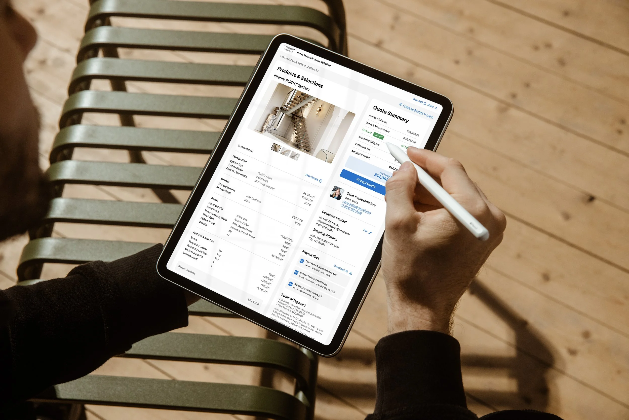
THE NEW EXPERIENCE
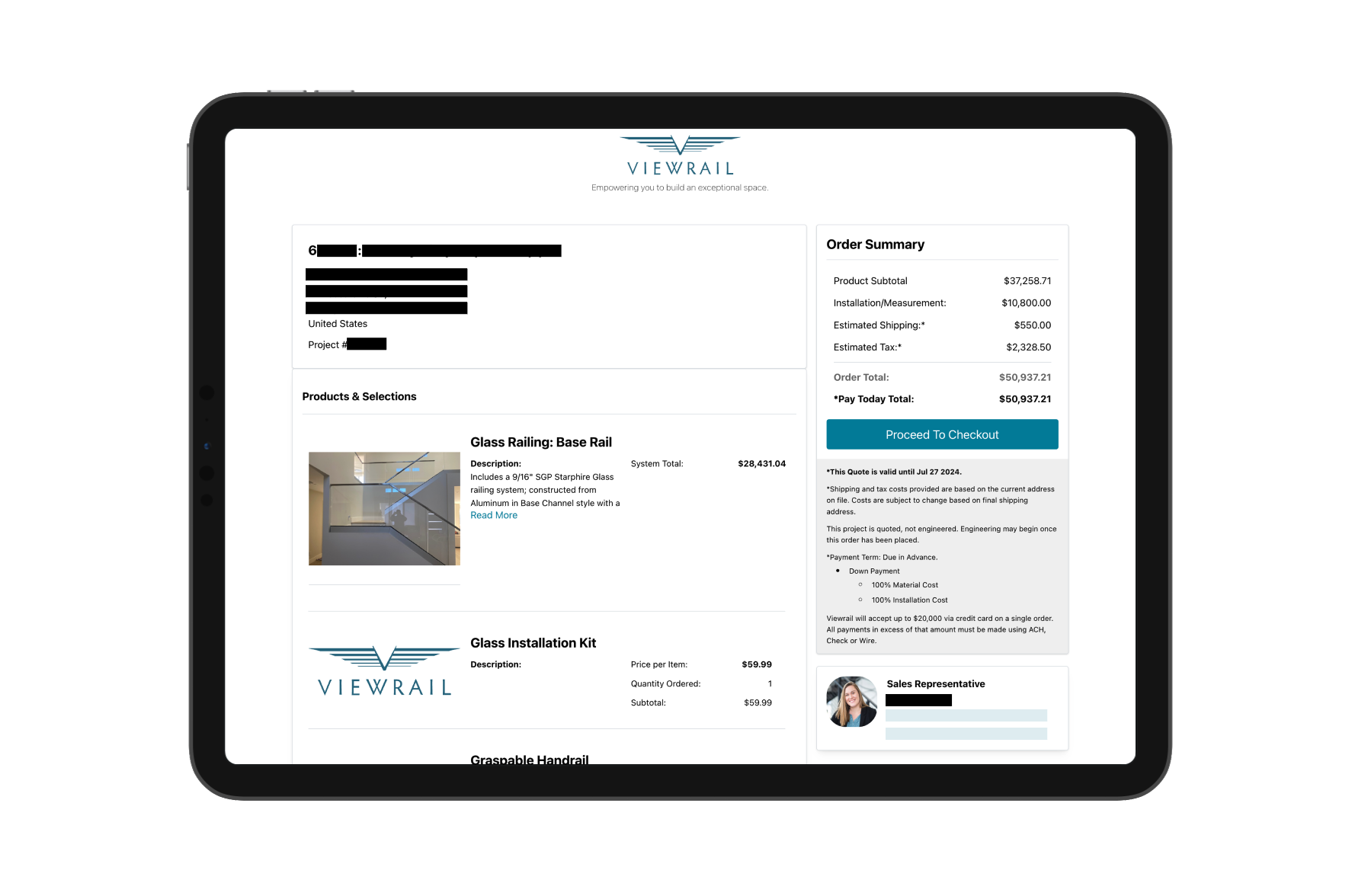
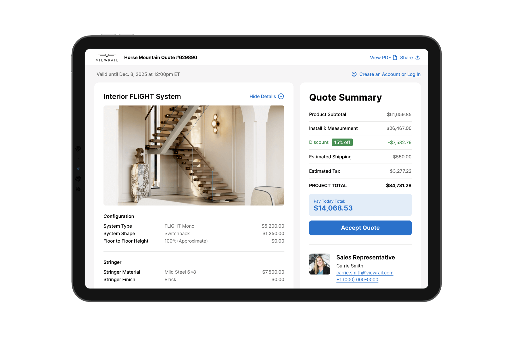
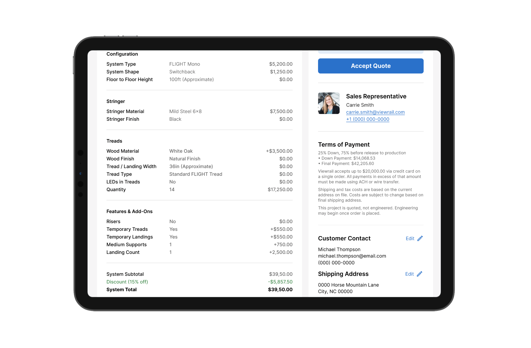
Simplified cost summary
Updated visual styles and the addition of clear line items for installation costs and discounts improved users’ ability to quickly scan and understand their Viewrail digital quote.
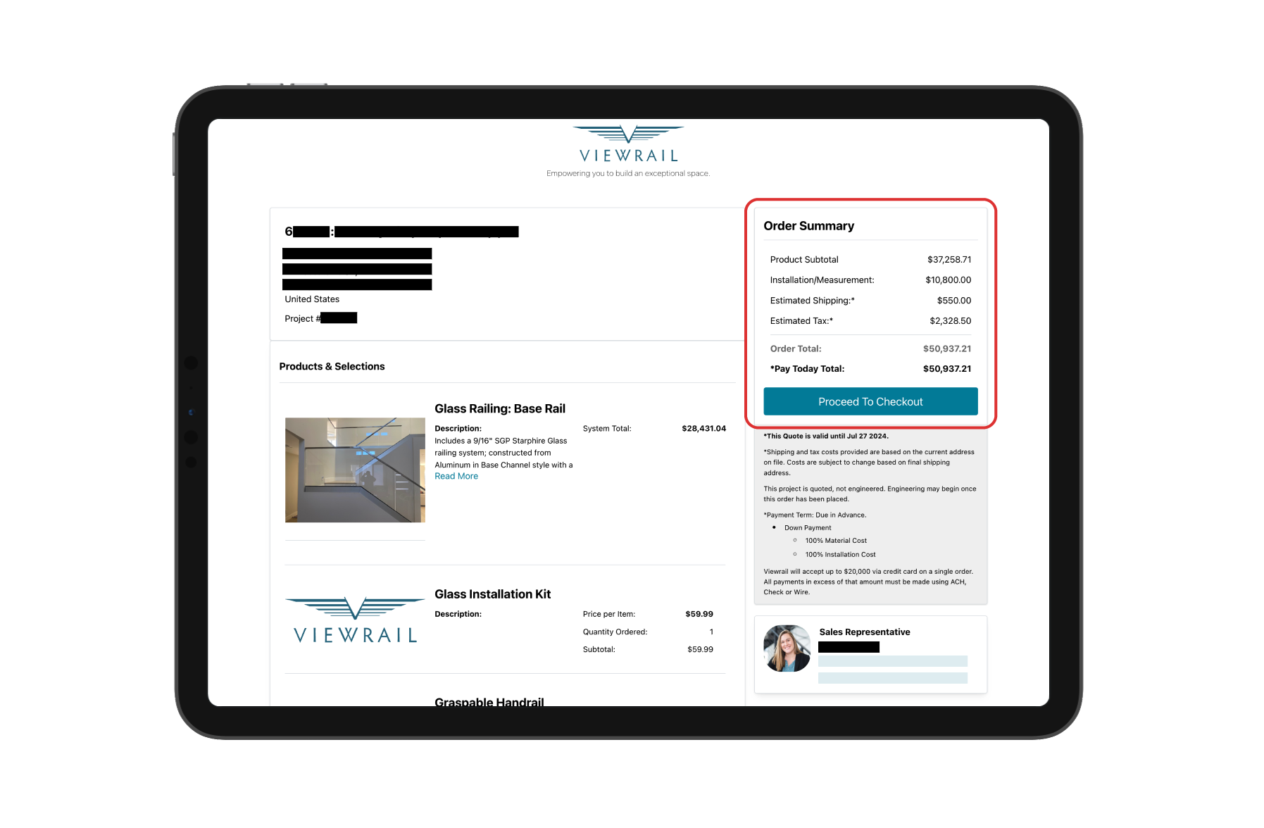
Before
After
Clearer system descriptions
New itemized line-by-line breakdowns for each system replace paragraph-format descriptions written manually by Sales Reps (a high-risk and preventable workaround). The new UI give users a detailed understanding of what’s included, what adds additional cost, and exact quantities.
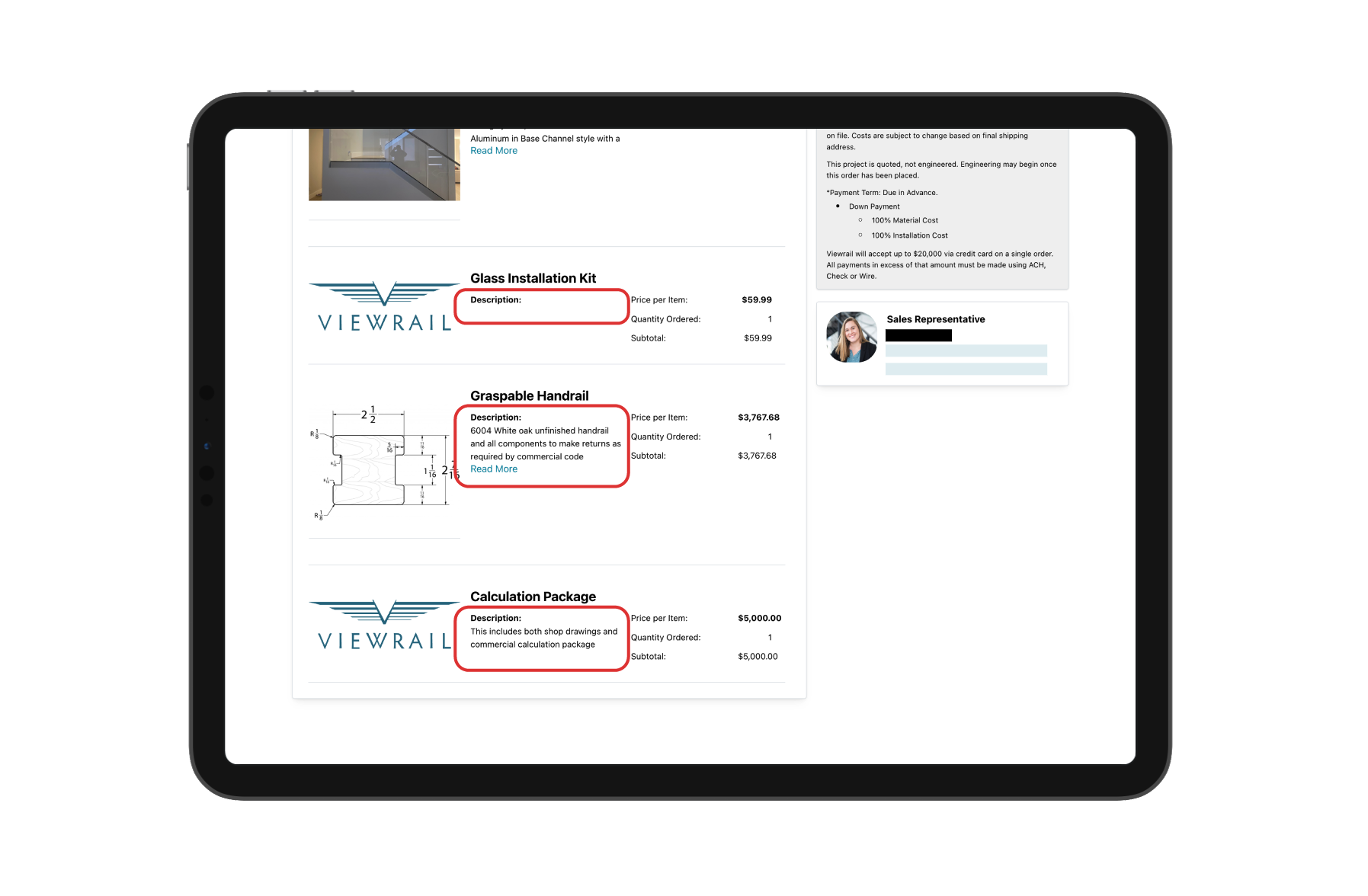
Before
After
New “Project Files” section
The updated UI introduces a Project Files section that allows users to download all related files in one place, replacing the previous one-off email process. Users can also view files associated with individual systems directly within the notes area of each system card.
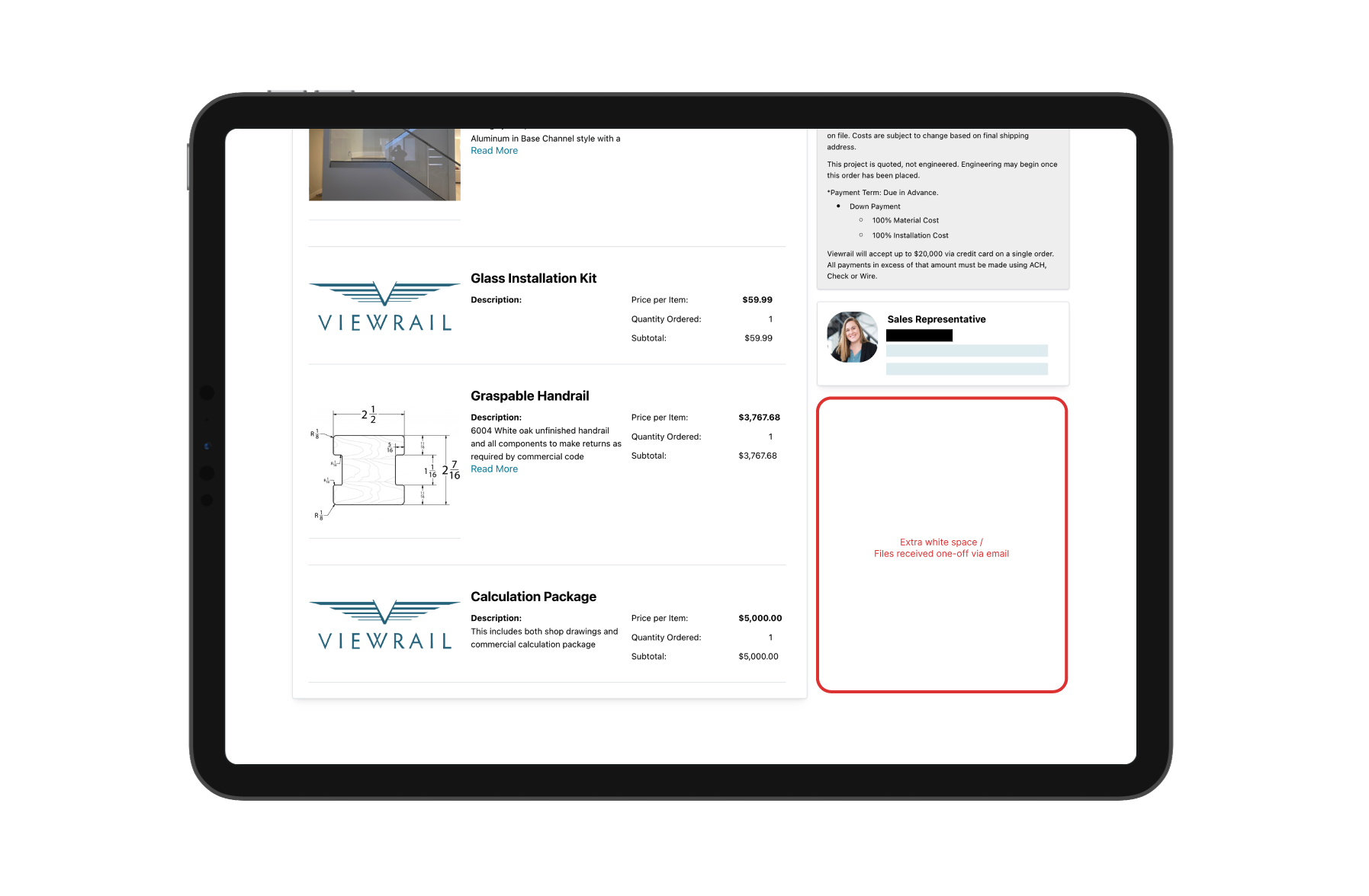
Before
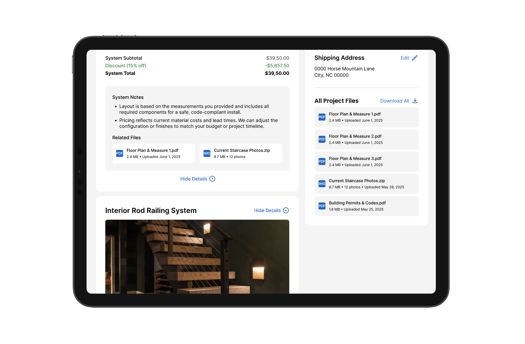
After
TAKEAWAYS
Emerging tools, collaboration, and craft were all key
The AI-enabled ideation workflow I piloted enabled faster exploration and earlier stakeholder alignment by making ideas tangible sooner.
Close collaboration with cross-functional partners was critical to balancing user needs with business goals and technical constraints throughout the project.
The work reaffirmed that strong visual craft is not decorative in high-ticket, luxury sales. When integrated into strategy, craft becomes foundational to trust, confidence, and conversion.
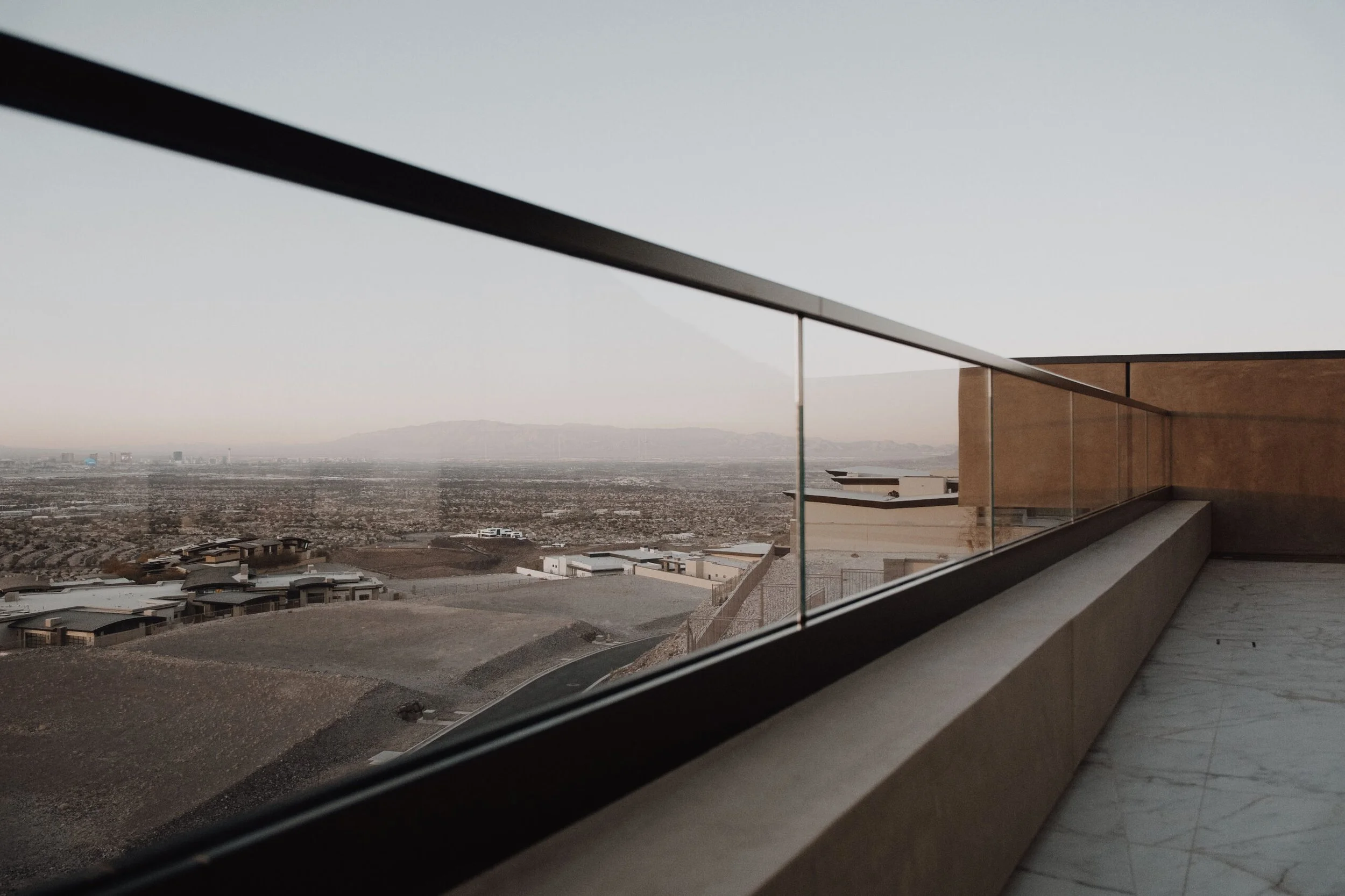
Myself, an installer, and another Viewrail team member on a site visit